The Surfer’s Journal is proudly reader-supported since 1992. We rely on membership rather than advertising to remain commercially quiet. Become a member below and gain access to every article ever published along with many other TSJ member-only benefits.
Create a free account to access three complimentary articles, or become a member to unlock all editorial and become a supporter of independent surf journalism.
Subscribers to The Surfer’s Journal get access to all our online content as well as the TSJ archive. Become a member to unlock all editorial and become a supporter of independent surf journalism.
In the summer of 1991, David Carson joined Surfer magazine as the art director, and an argument soon erupted in the office over his first cover design. Carson had been supplied an otherwise forgettable action shot of surfer Shaun Munro bashing the lip of a closeout section at Winkipop—the airbrush-and-logo-saturated surfboard, the multicolor wetsuit, and the gaggle of long blond hair whipping in the offshore wind—a perfectly stale emblem of ’80s pro surfing, dragged forward into the early ’90s.
“The last thing I wanted on the cover of this big new redesign of the magazine was a stock color photo of some surfer doing a ‘rad’ move,” Carson says, recalling the incident more than 30 years later. “There was something so lacking about it to me. I was never a fan of this idea that action shots should be perfectly lit and perfectly in focus in order to be considered a great photo. It’s kind of deadly. There’s a whole world of emotion and feeling beyond that.”
In protest of the state of the art, Carson presented a cover layout of the shot in black and white. The publisher immediately rejected it, on the grounds that the photo, sapped of its color, would kill newsstand sales.
“We all went to war over that first cover,” says Steve Hawk, then the recently appointed editor-in-chief at Surfer, who’d lobbied the publisher hard to hire Carson as art director, only to find himself mired in immediate conflict.
At work on the The End of Print poster series in Barcelona, Spain, 2001. Photo courtesy of David Carson/Espai Gràfic
Hawk knew that the magazine was desperately in need of a redesign. “Without having David as art director, it seemed to me that we would have been following rather than leading,” he says. “When you have someone in a creative position like that, I’ve always felt it’s better to need to reel them in rather than someone you have to force to be experimental and bold. Dave was a big, powerful fish who was hard to reel in. The rebelliousness you see in his artwork extended to the workplace.”
The black-and-white cover layout was case in point, and the exact kind of sideways design choice that had left those ranking above Hawk reluctant to hire Carson. But rather than conceding, Carson was only emboldened by the objections. Standing in the office with Hawk, he ripped the publisher’s preferred color layout of the cover in two and placed one half over his preferred black-and-white layout, making a new cover that was half black-and-white and half color. “It immediately glowed,” Hawk says. “We knew right away, that was it.”
The publisher approved the cover, and it soon shipped to print for the October 1991 edition. But anyone who remembers that issue of Surfer knows that Carson’s early victory with the cover only gave way to a larger war, just as soon as the magazine made its way to subscribers.
“I very quickly had a stack of letters from our readers that was at least 3 inches thick, laid flat on my desk,” says Hawk. “About half the letters said, ‘What have you done to the magazine of my youth?’ And the other half said, ‘It’s about fucking time.’ The redesign of the magazine was astonishing and jarring for readers. It’s especially striking if you look at that first issue Carson did versus the one or two right before it. Some articles Carson designed had unexpected breaks amid lines of text, laddering down the page. The fonts were strange, and it could be hard to read. I had some letters saying, ‘Hey, send me an issue that’s not fucked up, because clearly there were printing errors in the one you sent me.’”
Album, video, and poster art for David Byrne’s live-in-concert 1994 release Between the Teeth. Courtesy of David Carson.
Carson’s idiosyncrasies were on full display throughout the issue, what surf historian Matt Warshaw later called “industrial meltdown style—featuring compressed text; mismatched font size; chopped, scratched, cut, and mixed type; and radically cropped photos.” Although such remembrances, centering on the controversial aspects of Carson’s work, dominate history— at Surfer and at other times throughout his career—they often overshadow its brilliance.
Hawk points to the opening spread of a portfolio featuring Art Brewer’s photography, from that first issue, as an example: The word “art” is set vertically in large, lowercase font on the left page, playing up the contextual second meaning of the photographer’s first name while also, more subtly, harking to the way photographers of that era marked the physical frames of their slides before submitting them to the magazine. “That’s Carson at his best,” Hawk says, “when he’s not putting his own artistry out front, but it’s in service of the greater good. He might argue that’s what he does every time, but I also understand the argument could be made that at times it’s too heavy-handed.”
The other page of that opening spread from the Brewer portfolio features a large illustration by Matt Mahurin, a then on-the-rise and now highly sought editorial artist, just the kind of highbrow work sorely lacking from surf magazines without a tastemaker like Carson at the design helm. The selection, pairing, and dramatic cropping of Brewer’s photos only drew their beauty into higher relief.
“There’s a very fine line between simple and powerful and simple and boring,” Carson says. “And when I got to Surfer, the design had become simple and boring.”
The cover controversy of his first issue illustrates a central misunderstanding of Carson’s career, where he often advocates for simplicity but is remembered for complexity. His proposed black-and-white cover, and many of his covers at Surfer, could not be any cleaner when compared to those from other eras. Any complexity was born out of office tensions and commercial pressures. But it’s what Carson does with that tension and pressure that makes his work memorable. The revised cover spoke even more poignantly to that moment at Surfer: the shift from black and white into color, signifying a new era—a magazine freshly thawing from a design ice age—freeing Carson’s sensibility, illustrations, and type to lay fresh (if somewhat feral) tracks.
UNTITLED, 2022, screenprint, collage, and mixed media on paper, 24 × 36 inches. Courtesy of David Carson.
“David brought the most forward-looking design to Surfer since John Severson,” says Jeff Divine, who served as the magazine’s photo editor throughout that period. “The judgement by committee that you sometimes deal with when making a magazine can be so ridiculous. David had his own vision, and it rattled people’s cages. He would roam through slides in my office and pick certain photos you wouldn’t expect that blew me away. The basic friction was that readers had become so addicted to exactly how they wanted the magazine to look, and if anyone messed with it at all, they began to react negatively.”
Although the redesign unmistakably bore Carson’s singular vision, in more essential ways it was a return to Surfer’s founding principles, where Severson’s own artistic bent originally gave life to a magazine with rich illustrations and a willingness to experiment. “I didn’t think my redesign was that radical,” Carson says. “The way I thought about my work at Surfer was bringing attention to detail. Nothing was automatic—where to start a new paragraph or sentence, the fonts, the way captions were set, the way pull quotes and headings were handled, and the way that even page numbers had their own unique design. Everything was taken into consideration rather than just sticking a big glossy photo on a page. I met Severson years later, and we became fairly good friends by email. He appreciated the artistic part of the redesign, and how it brought the use of illustration back to the magazine, which hadn’t been done so prominently in quite a while.”
Another irony in the reaction to Carson’s “heretical” redesign of Surfer was his own intense reverence for the magazine. Growing up, he studied every page of the so-called “bible of the sport,” until he had memorized issues from cover to cover. “If you had told me as a kid that one day I would be art director at Surfer, that would have been it—a dream come true,” he says. “I couldn’t imagine a better job. I remember every photo and could recite every caption from the surf magazines I read growing up, but Surfer was the one.”
No bible’s new testament would be complete without scapegoating its prophets, and the new testament of surfing’s bible proved no different. What we can take from the parable of Carson’s time at Surfer is that our childhood dream jobs often prove false pinnacles. Although his influence on the magazine carried forward for decades, his time there lasted just a couple years, marking not a career peak but the beginnings of an even greater ascent.
*
If David Carson was designing this story, you might not be able to read any of it—literally. On at least one occasion in his career, finding a writer’s work entirely subpar and objectionable, he set the story in an unreadable font: Zapf Dingbats.
As an homage to Carson, I considered setting his name in Zapf Dingbats each time it appeared throughout this profile, which would read ✤✢✤✦✦✜✜❋✲✲■▲◆■, thus giving the real Carson-heads out there a fun little puzzle to decode. But that kind of cheap trick would really be caricaturing Carson’s work more than it would get to the heart of why it matters. And, to give Carson his fair shake, I must acknowledge here that there is something plainly objectionable about beginning a profile of David Carson where I’ve chosen to do so, at Surfer magazine, clearly not the high point of such an illustrious career. (Which is to say there’s a chance Carson really would zapf this profile—or render the opening section unreadable in an even more inventive way—if he were the one designing it.)
The list of accolades and achievements where Carson might prefer this story to begin has by now grown far too long to list. But, for the unversed, here’s a quick highlight reel: Carson has designed album covers for Prince, Nine Inch Nails, and David Byrne. (Hell, he even named the band Bush while designing their first album.) He’s worked on Super Bowl commercials for Budweiser and, over the long arc of his career, collaborated with Armani, Nike, Mercedes-Benz, American Airlines, Ray-Ban, and seemingly half the other major brands you’ve ever seen.
Even Carson’s personal life is dripping with nearly unmatched design swag: He named his youngest son Carson. Yes, that’s right. One of his sons really is named Carson Carson. And, in perhaps the ultimate design hack, he’s managed to live part of the year, for more than 25 years, at his home overlooking an idyllic right pointbreak in the Caribbean (more on which later).
Carson with his first surfboard—a used Bing—at his childhood home in Palos Verdes, circa 1965, before his family moved to Florida. Photo by Donna Carson/courtesy of David Carson.
I don’t need to call Carson one of the most innovative graphic designers of the last century myself, because Apple already did, on the list of its “30 Most Innovative Users” at the turn of the century, which featured only one other graphic designer. Carson has written the master class on graphic design. (No, really—the company MasterClass offers an online course with David Carson where you can learn the craft from him directly.) And among his peers in the design world, he’s been called “the reigning Picasso of the international graphic design community” by B. Martin Pedersen, the creative director of Graphis, and “the Paganini of typographers” by artist and designer Ed Fella.
Before speaking with Carson myself, I find all of this somewhat overwhelming. How to best encapsulate such a momentous career within the confines of a surf magazine profile?
So, on first meeting David Carson, I ask him to design my escape from this undertaking. My first question for him: If you were in my position, what would the David Carson–designed version of this profile look like?
I want him to give me a blueprint that will propel the story forward—the form that will inform the story’s contents—but at first he gracefully avoids the question. “In a way, that’s too easy,” he says, an amusing Carson burn that nonetheless isn’t quite actionable advice.
So I find myself asking him the same question each time we sit down for an interview—at one point even going so far as to send him a proposed diagram of the story, all but begging him to rearrange the elements into some newfangled Carsonian design that will guide me—to no avail.
And then, in Carson fashion, only in our last conversation do I get a direct answer to my first question.
Regarding this profile, Carson says: “My first inclination might be to do what’s not expected. I would do something really simple and clean so that people might feel a little confused or pissed off. In a way, it’s a no-win situation. Give them some surprise and humor and elements no rule book would give you.”
So, if I may plead my case for a moment, I would like to propose that maybe, just maybe, beginning the David Carson story at his Surfer magazine redesign—a no-win situation that left some people unexpectedly a little confused and pissed off and surprised—seems the only right place to set forth. In Carson’s own work, it is clear that sometimes doing what you’re not supposed to do, with conviction, is exactly the right thing to do.
“If everyone loves your work, you’re playing it way too safe,” Carson says at more than one point during our conversations. “If everyone loves it, you probably haven’t pushed yourself far enough. It’s good to get some reaction and alarm. We probably wouldn’t be talking right now if my work hadn’t been controversial.”
*
Very little from Carson’s early life foreshadows the graphic-design career at which he later arrived. His childhood was filled with astronauts and surfing.
Carson’s father was a test pilot. An assignment at what is now Cape Canaveral Space Force Station, working on NASA’s Surveyor program, which made the first successful unmanned soft landings on the moon, had brought the family to Cocoa Beach, Florida, by the time Carson was 12. “I remember my dad telling me the reference point they used for the moon-landing gear was a three-legged milking stool because they didn’t know if they were going to land on a hill, embankment, or valley,” Carson says, noting the more subtle ways his father’s work stirred an early fascination with design. “The biggest thing that the program accomplished was validating that NASA could send a man up there and land safely.”
Astronauts would arrive at the Carson house in their Corvettes for cocktail parties. Carson also discovered the vibrant surf scene in Cocoa Beach alongside his older brother, who fell in with a gifted young crew including Mike Tabeling, Bruce Valluzzi, and Claude Codgen. When Carson was midway through high school, the family moved to Los Angeles for Carson’s father to take a job at Hughes Aircraft Company, where he tested fighter-jet prototypes for the military.
Carson was a naturally gifted surfer and found competitive success through his late teens and early twenties. He was sponsored by Rainbow Fins, Infinity Surfboards, and Katin, was featured in full-page surf magazine ads, and surfed in pro contests at Sebastian Inlet, Trestles, and Sunset Beach. But his personal interest was in surfing’s countercultural figures. “Miki Dora was—and maybe still is—my surfing hero,” Carson says. “I had an early gravitation toward people who were rebellious, and Dora was a rebel with good style.”
Carson’s first career after graduating college at San Diego State was as a schoolteacher. It’s quite possible that he may never have discovered his calling for design if not for a promotional mailer that he received for a two-week seminar at the University of Arizona. “The postcard was all about something called ‘graphic design,’” Carson says. “I remember thinking, ‘Wow, that’s a profession? You can do that for a living?’”
At Lunada Bay, December 1969. “This was my first time ever surfing Lunada,” Carson says. “There was no one in the water. I was riding a stringerless Johnny Fain model from Greg Noll Surfboards. This was before the advent of the leash.” Facing: photo by Guy Knight/courtesy of David Carson.
Carson enrolled during his summer break, and it got him hooked. While still teaching at Torrey Pines High School, he strung together early design gigs at skateboarding and action-sports magazines on the brink of financial collapse, moonlighting as TransWorld Skateboarding’s art director starting in 1984.
“The only real advertiser was Stacy Peralta at Powell- Peralta,” Carson says. “The magazine was just horrible. It was founded on a pretty soulful idea that the skateboarders would write the articles, take their own photos, and even do their own layouts, but it didn’t work at all.”
Carson stepped in after the third issue and continued for three more years, but he began to worry that he was getting typecast as an aging skateboarder rather than being recognized as a designer. “I wasn’t some frustrated older skater trying to hang around the sport,” he says. “I started sending out résumés to every single magazine in the world I could find. One of the only responses I got was from Musician magazine, based all the way in the tiny fishing town of Gloucester, Massachusetts.”
Just as he’d finally received tenure at Torrey Pines High, Carson quit his teaching job in the middle of the school year to pursue the job at Musician. But the owners of the magazine quickly found his graphic design too radical, and he was fired within a year. Carson was working another dead-end graphic-design job to support himself, at Self, in New York City, when he heard about a new magazine called Beach Culture, which was launching with the same publisher that owned Surfer magazine, in late 1989.
Here, Carson finally landed total creative freedom, even if the magazine’s readership was lacking, and he still frequently references the work he did there as among his favorites. “When I finished designing an issue of Beach Culture, I sent it to the print- er,” he says. “Nobody had to approve it. I pretty much had total creative freedom. It ended up being some of the best magazine work I’ve done.”
The design pyrotechnics that people associate with Carson’s work began to reach their full vibrancy. In one story, on director David Lynch, Carson set a column of text between two pages, in the “gutter,” to echo the avant-garde energy of the filmmaker—although it rendered the piece partly unreadable without ripping the magazine’s spine apart. In another story, titled “Surfing Blind,” Carson left the title alone—on two all-black pages for the opening spread—making an experiential nod to the subject matter of the piece.
As a reader, it’s likely you’ll react with either complete fascination or complete repulsion to these examples of Carson’s signature stunt work. If you consider magazines a basically transactional experience—where you go to look at pictures and glean information—Carson’s more experimental layouts are an annoyance and a disruption. But if you consider magazines an experience greater than their individual parts—more than just text and images—then you might enjoy the immersion of a Carson-led trip, hard to decipher as it may sometimes be.
One of Carson’s refrains is, “Don’t confuse legibility with communication. Just because something is legible doesn’t mean it communicates, and, more importantly, doesn’t mean it communicates the right thing.”
Before speaking with him, this struck me as a somewhat self-defensive statement, given that illegibility didn’t seem to resolve the problem of communication any better than legibility. But then Carson mentioned another quote, “The word is an image,” by William S. Burroughs, the Beat Generation writer known for his “cut-ups,” which rearranged prose in a collage, thus producing a new piece of writing, with new meaning.
Fittingly, Carson—a great transformer of others’ writing— speaking through Burroughs brought clarity to the challenging aspects of his own work. To Carson, words are images, and some of the most powerful ones we have, in the sense that each comes preloaded with meaning. But taking the words in Carson’s work only at their literal meaning is a little like taking an image of a sunset at its literal meaning. Yes, a sunset is the sun disappearing behind a horizon line, but if that is all you take from it, then you really have missed all its beauty, all its majesty, and its more central meaning. The same can be said of Carson’s work, which must be appreciated for its total effects.
It’s also important to note that at this point in Carson’s career, at Beach Culture, he was still designing on art boards, physically pasting each element of a layout—text, photography, illustrations, title treatments, captions, et cetera—onto cardboard before it went to print. He only began designing layouts entirely on a computer once he arrived at Surfer.
This is to say that designing a magazine, up to that point, was truly a work of collage. Carson’s design tastes—which can tend toward collage and mixed type, with everything highly mutable and nothing taken for granted—are unmistakably a product of that era. He has said, “Designers have become lazy and let computers make too many decisions for them.” And it’s hard to imagine his work emerging from within the pre-engineered confines of a design application built for ease of use, reducing margin for error, and a preference for uniformity.
“At some point, engineers took hold of design over graphic designers,” Carson tells me. “It’s only gotten worse over the years. There are plenty of programs that can lay out a whole magazine for you, and it’ll be fine. It’ll be readable. The page numbers will all be in the same place. But it’s lost something.” He describes students in his seminars relying too heavily on software guardrails that have become all but invisible to them. At one point during his MasterClass, he tells students, “We want your mind. We don’t want your software.”
At Beach Culture, after one too many dead-end magazine gigs, Carson developed an awareness that he had to begin promoting his own work in order to make a name for himself outside the insular surf-skate world. “I would send an issue of Beach Culture to every art director I could find on a masthead, or anyone I saw getting a write-up in the design journals,” he says.
Unreleased and final covers, plus interior spreads, from Surfer, Ray Gun, and Beach Culture, circa late 1980s to mid-1990s. Visuals and artworks courtesy of David Carson.
Screenshot
Screenshot
Although the magazine was commercially unsuccessful, it was award-winning for its design and developed a cult following that helped launch Carson’s career. His work was featured in Rolling Stone, and he received a call from a producer at MTV that was testament to how the magazine had wormed its way into popular consciousness. “This producer told me, “Hey, so listen, our advertisers are bringing in Beach Culture and telling us they want their commercials to look like it, and I just thought you’d like to know we do it for them.’ He thought he was paying me this great compliment, but at that point I was barely scraping together gas money. I was like, ‘I’m available! I need more work!’”
Beach Culture lasted just two years and six issues, but it led to the art-director position at Surfer, located in the same office building. Compared to the total freedom of Beach Culture, it’s understandable that the expectations of readers at Surfer, and the magazine’s well-established legacy, felt immediately constraining. “Surfer was the first place where I got a ton of negative reaction from readers in my career, and that did throw me a little bit at first,” Carson says. “By the time I got there, I could also feel all my curiosity and energy shifting more toward graphic design.”
Carson’s time at Surfer was cut short by an attractive new opportunity. The publisher of Ray Gun, a new music magazine set to launch in 1992, had taken note of Carson’s work at Beach Culture. “I put together the first-ever issue of Ray Gun in the Surfer offices at night, after working on Surfer all day,” Carson says. “It immediately got a lot of attention, and took off quickly. Once that happened, I left Surfer. Music at that time was changing, and the other magazines—Rolling Stone and Spin—still looked the same as they always had. Ray Gun was truer to the music and the artists of that time period.”
As Ray Gun became an emblem of the ’90s zeitgeist, Carson’s design aesthetic served as the visual language to convey the fracture between traditional rock and alternative. Yet Carson is quick to note, “I like the word ‘grunge’ about as much as Kurt Cobain did,” again finding fault with words at their plainly literal. Pundits labeled Carson’s work “grunge design” and “dirty type” in an attempt to make it synonymous with the music of the period. “There is no such thing as grunge design,” Carson says, eager to set the record straight anytime the topic of Ray Gun arises. “There’s a lot of work from that era people assume is mine that I would never do.”
But the cultural tailwinds from Ray Gun had the undeniable benefit of bringing commercial demand for Carson’s work. A profile of him on the front page of the New York Times Style section in May of 1994 had people beating down his door. “I was living in Del Mar, and I remember getting woken up one morning, a little hungover, not long after the article came out,” Carson says. “These two Japanese businessmen, both dressed in suits, were banging on my door, thinking it was my office. They were speaking in broken English but had very clearly read the article and were interested in my work.”
Visuals and artworks courtesy of David Carson.
Screenshot
Screenshot
Carson’s time at Ray Gun ended in late 1995, as another cover controversy imploded with that magazine’s publisher. He was designing the third-anniversary issue, featuring David Bowie. The magazine had commissioned a photo shoot of Bowie for the cover. “When we got the images back, I had one that I thought was very clearly the cover,” Carson says. “It was just this weird bit of David Bowie’s neck. It was so striking. I thought it was a no-brainer to go on the cover.”
The publisher, whose favorite artist was David Bowie, did not agree. “He asked me how people were going to know that it was a photo of David Bowie if it only showed his neck,” Carson says. “I told him, ‘Well, maybe it’s because it’s gonna say ‘David Bowie’ on the cover. And it’s cool. And it’s Ray Gun.’”
The publisher vetoed the layout in favor of a token headshot of Bowie. “That was the tipping point,” Carson says. “I didn’t ask them to send me the next issue to design, and nor did they send it. As soon as that cover didn’t get approved, I left. I already had so much commercial work by then, so I never regretted leaving. I moved to New York shortly after that and was never busier.”
Unreleased cover of Ray Gun. Courtesy of David Carson
Although the move took Carson away from the comforts of his surfing routine in Southern California, he saw graphic design guiding his life path as a blessing. “In retrospect, I feel I was very fortunate in that I never had to confront ‘aging surf guy syndrome’ the way a lot of people I knew were still trying to compete, or running a surf shop to make ends meet,” he says. “I tell students if your work is what drives you, then go wherever that work is and adapt. That’s pretty much what I did. Surfing was no longer the driving force as my creative life took over.”
But just as business was booming in Manhattan, Carson got a call from his older brother that would counterbalance the scales between his career and surfing life again. Carson’s brother was living on a sailboat in the US Virgin Islands and invited Carson and his girlfriend down for Christmas to offer some reprieve from the frigid winter in the city. On a whim, they decided to sail over to Tortola on Christmas Eve, anchoring in Cane Garden Bay, with the hope surf would arrive the next day. “When I got up on Christmas morning, there was a fun little right breaking along the point where we had anchored,” Carson says. “I borrowed one of my brother’s boards and had a really fun surf. That day kind of reignited something in me.”
ScreenshotUnreleased design for Samsung Galaxy S8 campaign, 2017. Courtesy of David Carson.
01
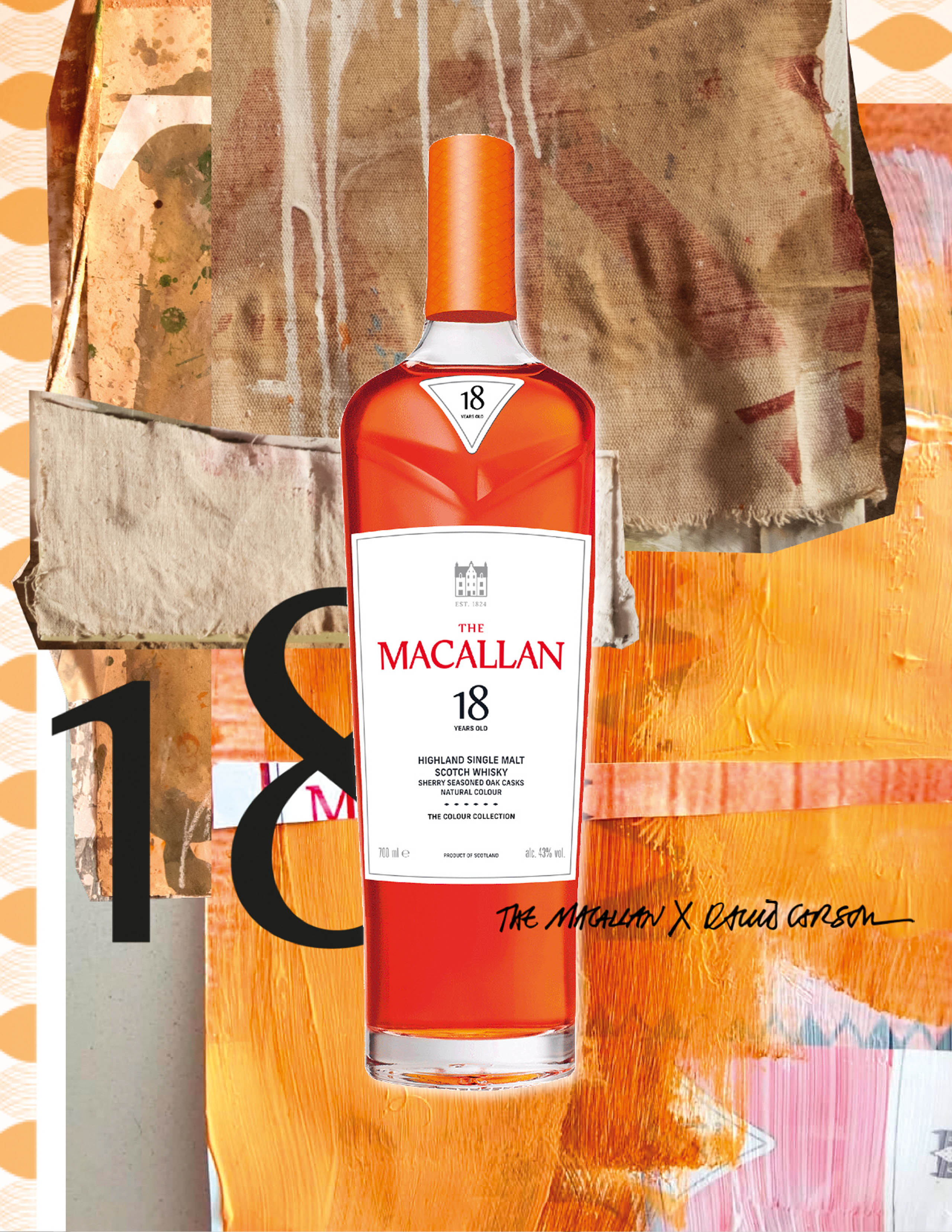
ScreenshotMixed-media painting and collage for The Macallan, 2024. Courtesy of David Carson.
02
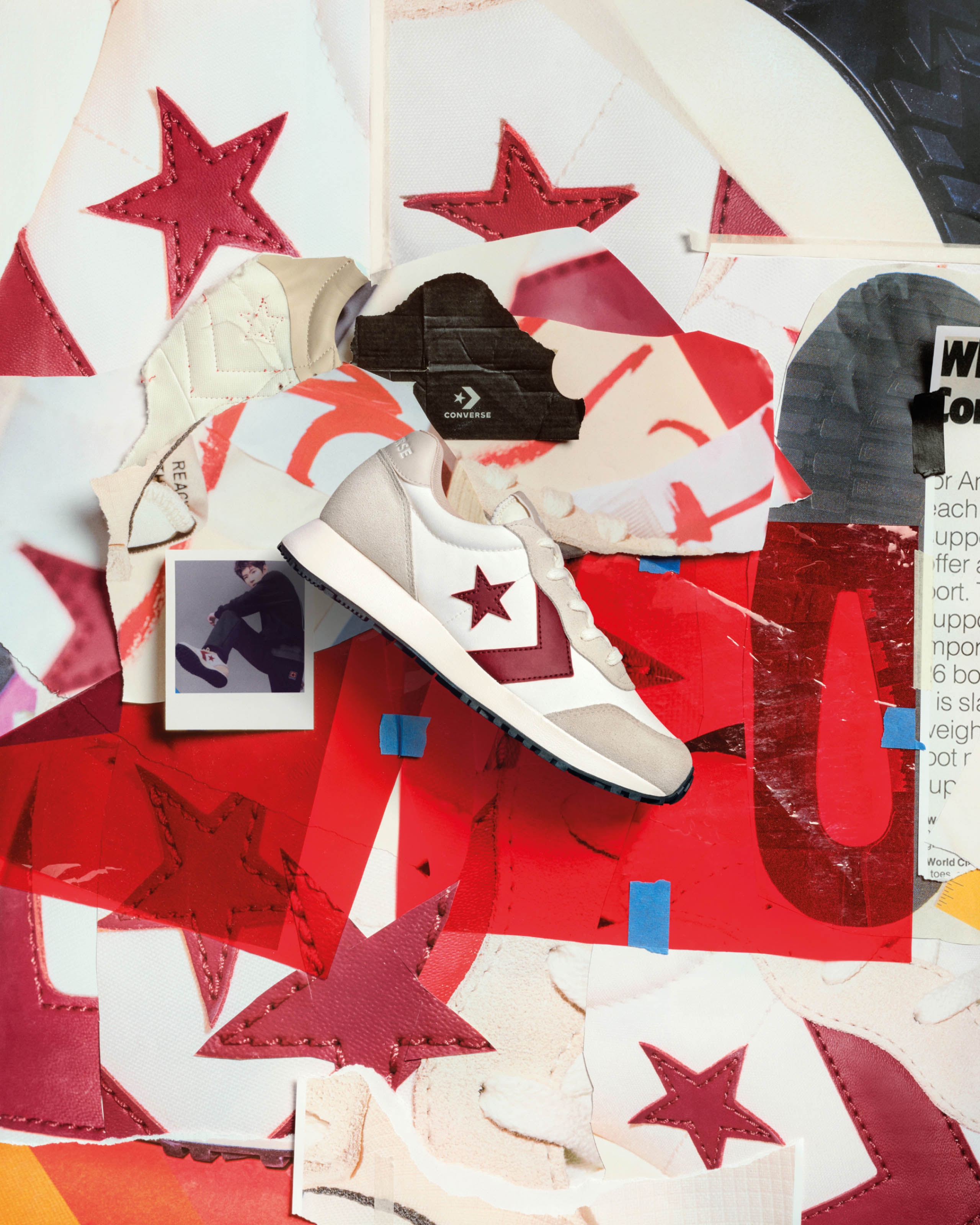
Mixed-media assemblage for the Converse Heritage Campaign, 2025. Courtesy of David Carson.
03
+ Click to enlarge
The next morning, they had to leave. The swell had filled in, and more waves were reeling down the point unridden, with clean offshore winds grooming the electric-green Caribbean water and just a few surfers in the lineup. “I remember vividly standing on the deck of our boat as we were leaving the bay,” he says, “and watching these other surfers catch waves, thinking to myself, ‘Why are we leaving?’ But we did, and that was it.”
Or, rather, that would have been it, if Carson’s brother hadn’t called him again a few months later. This time, he told Carson, “Hey, remember that wave we surfed? There’s a house for sale right there on the point.” All the listing showed was an aerial photo of the property, delineating where the lot was located: oceanfront along the point.
That was all Carson needed to see. Meanwhile, he’d been stacking his chips high in Manhattan, coming off a recent ad campaign for Nike and designing an album cover for David Byrne. “I happened to be kind of cash rich at the time,” Carson says. “Without knowing anything about buying a house—I had never bought one—I decided to make an offer, sight unseen. Only now do I realize it was a stupid, ridiculously low offer relative to where they had listed it.”
The owners responded with a nice note stating Carson’s offer was “just a little too low.”
Carson responded, naively, with what in hindsight he describes as “an insultingly low counteroffer,” and got no reply.
Then, a few months later, his girlfriend asked what had happened with the house.
Carson decided to call the realtor.
“The realtor said, ‘Oh, jeez, I’ve been meaning to call you. The owners accepted your offer.’ I turned to my girlfriend and said, ‘I think I just bought a house.’”
Out front in Tortola, 2017. Courtesy of David Carson.
At this point, Carson had never set foot on Tortola. The island was still a figment of the Christmas boat trip. He arranged to quickly fly in to see the house and sign the closing paperwork before a business trip he already had scheduled in Argentina.
“I thought, ‘Okay, I at least need to go look at this house to make sure I really want to buy it,’” Carson says. “So, I got a room in a local hotel near the point and arrived at night in all my New York winter clothes. I remember walking out to the water, and all the unfamiliar smells and sounds of the Caribbean. I had to get to Argentina the next day, so I decided to try to walk out onto the point that night to see the house. I was sweating like crazy, and after getting about halfway out to the point, I decided, ‘I’m doing this. Of course I’m doing this.’ I still hadn’t seen the house. I turned around, went back to the hotel, and told the realtor, ‘It’s a deal,’ and I left on a flight the next day.”
*
Fast-forward more than 25 years, and Carson has yet to miss a winter on Tortola. The house has stood through a Category 5 hurricane (Irma), the birth of Carson’s three children, and more great sessions than he can recall.
“I’ve never had a moment of buyer’s remorse,” Carson says. “The waves are fickle, and that’s what’s saved it from becoming spoiled by crowds. Surf forecasts still get things wrong all the time. As long as I keep having at least one amazing session every year with no one else in the water, I’ll always be back.”
PERHAPS MEXICO, 2024, screenprint, collage, acrylic paint on poster board, 24 × 36 inches. Courtesy of David Carson.Ideations and iterations for John Coltrane’s 1963: New Directions, 2018. Courtesy of David Carson.
The house sits on the center of a 2-acre lot overgrown with lush tropical vegetation, opening directly onto the point at Cane Garden Bay, which allows Carson to keep an eye on the surf conditions while he works. “I’m there to surf, so I’ve never tried to make it into some showcase property,” he says. “It’s pretty much still a surfer’s bachelor pad with world-class views.”
However, Carson did commission three paintings from John Severson for the house, and one of them, which survived Hurricane Irma, still hangs inside. “I remember talking to Severson when he was working on the paintings, and he told me he couldn’t sleep because there were supposed to be waves coming,” he says. “This was pretty late in Severson’s life, and I remember thinking, ‘Jesus, the guy’s 74 and he’s still just as surf stoked as a grom.’ As time progresses, I totally understand how for some people it doesn’t go away. I still have a hard time sleeping when I know there’s gonna be surf. I’ll be awake in bed, imagining a very specific turn that I want to do, or I’ll be up, looking at the whitewater to see signs of the swell filling in.”
Carson immediately becomes animated whenever the topic of conversation shifts to surfing, and he’s just as highly opinionated about the art of riding waves as he is about his graphic-design work. “In my era, coming up as a surfer, one of the most important things was a bottom turn, and those have kind of become a lost art, largely because video overtaking photography has removed them from focus. Leaning over and putting your hand in the water is still a huge part of my surfing now,” he says, highlighting a tra- ditional and minimal approach to surfing—hardly the aesthetics most commonly associated with his tastes as a designer.
“I still see photos of myself surfing and realize, ‘Wow, I’m holding my hands the way that I saw photos of Billy Hamilton on his cutbacks.’ His palms were perfectly relaxed, but his fingers were all together. I’ve always admired surfers with good natural style and power—Tom Curren, Miki Dora, Andy Irons, to name a few. The surfers with naturally great style are the ones I keep coming back to.”
Each winter, Carson brings at least a couple new boards down to Tortola, accumulating an eclectic quiver of Mini Simmons, twinzers, asyms, quads, twins, and bonzers. “There’s at least 50 boards at the house, and they all have a story,” he says. “I like traveling with boards—just having them around and feeling the rails. They’re nice objects.”
Mixed-media painting and collage for The Macallan in Igualada, Spain, 2024. Photo by Denis Delestrac/courtesy of David Carson.
Despite the wide selection of designs on the rack, lately Carson has found himself riding a quad with one fin broken off the heelside rail. “I’ve always loved riding experimental boards,” he says. “I want something that doesn’t look like every other board and [to discover] whether or not it works. Does that 2 extra inches on one rail of an asym really make a big difference? I don’t know. There’s a big part of me that likes people in the lineup saying, ‘What the fuck is that board you’re riding?’ There’s a carryover to my work in the design world there, for sure.”
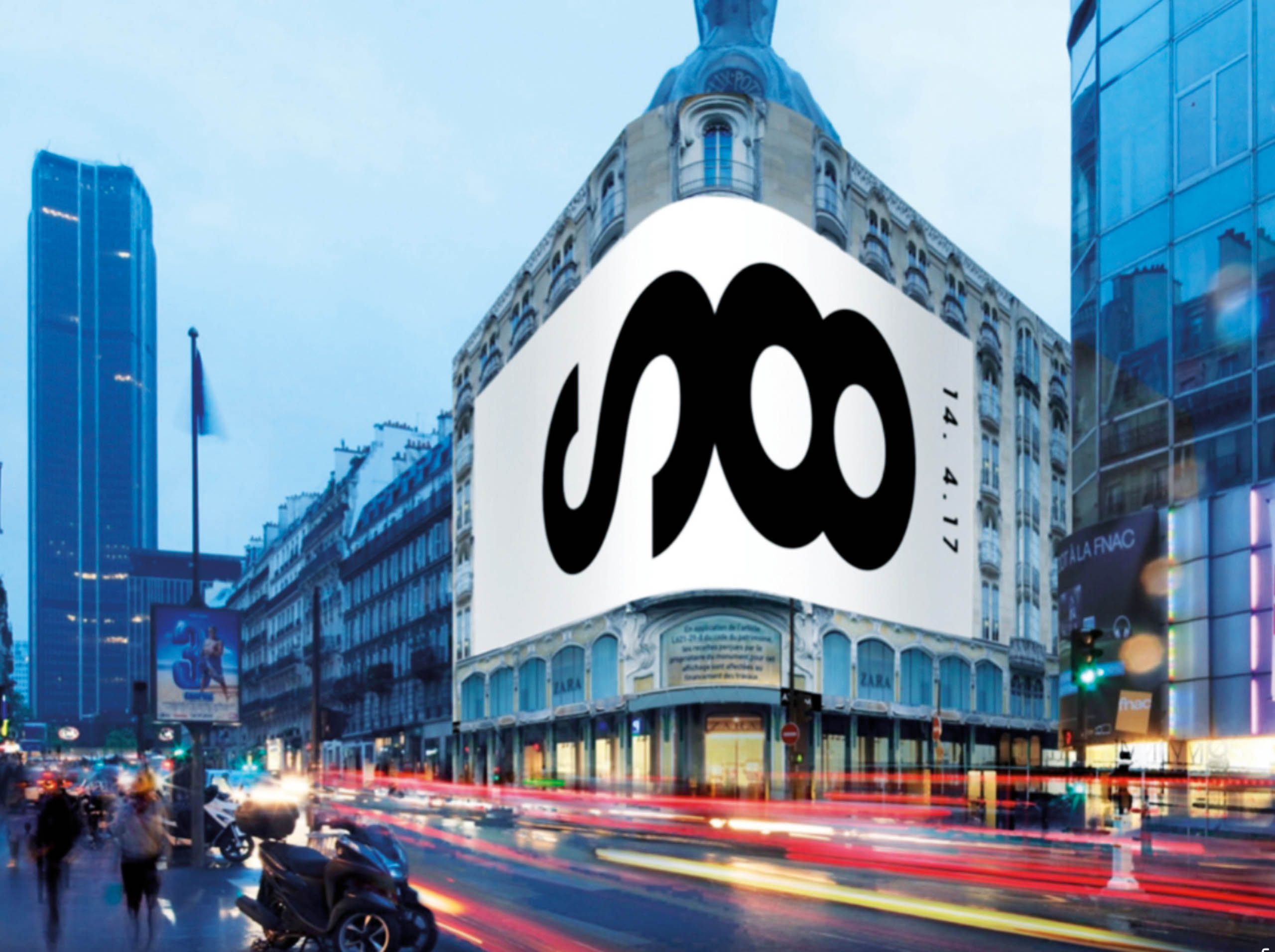
While Tortola has been his only fixed residence in recent years, a mostly nomadic existence has done little to slow his productivity. Carson has never been precious about where or when he works, setting up a makeshift studio in any garage, borrowed guest room, office, or hotel where he can find space. Perhaps owing in part to a return of ’90s style that the Manhattan Creative-Director Class seems convinced has entered the zeitgeist, business of late has been good for Carson. At the time of writing, he’d completed or was in progress on projects including a full brand redesign for scotch-maker The Macallan, as well as campaigns for Converse, Adobe, Stüssy, the cycling company Rapha, the 140-year-old Swiss furniture manufacturer USM Modular, and a series of three album covers for the rapper A$AP Ferg.
“I hear from creative agencies all the time now that the ’90s are back,” he says. “But I always say, ‘No, you can’t go back.’ It’s kind of funny to me that, through so much technological change, I’m doing collages by hand again for some of my biggest clients. So it’s a bit of a revival, but I think it’s also something more than that.”
After studying Carson’s work, trying to come to some grand unified theory of what gives it an enduring quality, it’s striking that it entered the zeitgeist in the ’90s and is now, in the mid-2020s, finding some resurgence. Both decades represent ages of anxiety over progress in the digital sphere threatening to change the way we live—in the ’90s, with the rise of the internet, and today, with artificial intelligence.
Carson’s work is not a reflection of those trends but rather a counterpoint to them. It is not the perfectly set, perfectly aligned, perfectly uniform columns of text delivered by CPUs and GPUs. His work renounces the very notion of an operating system. It’s an affirmation of human creativity overcoming the auto-tuned, auto-corrected, computer-generated smooth-braining of our time. It’s a reminder that when we are ready to rebel, we can, if only we find the courage to live as Carson’s work urges us to live: often boldly, occasionally
out
of
line.
YER WAVE IS COMING (with Ramón Enrich), 2025, acrylic on canvas with lettering added in Quark Express, 24 × 32 inches. Courtesy of David Carson.
[Feature image: SURF.DESIGN.LIFE., 2025, collage mixed media with background lettering from George Bates, 24 × 32 inches. Artwork courtesy of David Carson]
Premium Membership
From $179.00
Become a premium member of reader-supported, independent journalism. Our premium members advance the work of The Surfer’s Journal. Enrollment at this level includes:
Bi-monthly delivery of The Surfer’s Journal
Custom Annual Gift
Listed as a TSJ premium member on surfersjournal.com
25% off merchandise and apparel in the TSJ store
Unlimited access to every article we’ve ever published