

A lot of my work is transparent with my influences. I’ve done a lot of research about surf history, graffiti history, art history, and punk subculture—and that’s reflected in my art. I’ve learned as much as I can about these subjects and yet I’d love to learn more.
I grew up influenced by the DIY, hardcore, punk music scene. When I got a little older, and started making art, I found that DIY wasn’t strictly relegated to music subcultures. There were so many different types of makers who would create something to fill a specific need they had, including surfers and visual artists.
Currently, I find myself looking mostly at my friends’ work, many of whom are multidisciplinary artists with a DIY ethos. I want my art to be directly in dialogue with theirs: Leigh Gallagher, Kevin Parme, David Berezin, Eric Sidner, Rian Pickell, Kanoa Zimmerman, Rachel Kaye, Harsh Patel, and many more, including some of the artists I talk about in depth below.
These are people I relate to on a “making” level. I’m inspired by how multidisciplinary artists create a balance of complex subcultures and practices. Each of their interests could be lifelong pursuits, in and of themselves, yet they manage to do great work in different modes, as well as engage with other pursuits, such as surfing.
To quote the 1982 documentary Style Wars: “The idea of style, and competing for the best style, is the key to all forms of rocking.”
While I was a student at California College of the Arts, one of my teachers told me to check out this Jay Nelson show. I missed it, unfortunately, but soon afterward I found myself at Needles and Pens, a DIY zine store and gallery in San Francisco’s Mission District, where Jay was working the register.
We had a lot to talk about right away. He’d grown up surfing in the Palos Verdes area and was making great work. Back then, Jay was doing these intricate graphite drawings that really blew me away. He had an incredibly rigorous drawing practice that I admired. He was also building these beautiful tree houses and I ended up sleeping in one for six months. He was such a talented craftsman, which may be connected to his past of shaping surfboards. He’s an incredibly proficient builder and carpenter.
I didn’t really know how to surf at the time, and Jay was like, “Let’s go surfing!” That’s really rare—to have someone who is knowledgeable about surfing and generous enough to take you out. He became a mentor to me, in terms of both surfing and art. He was the first person to tell me I didn’t have to wear a leash, especially in small waves. He told me I should learn to fall and hold onto my board and to get comfortable swimming, so I stopped wearing a leash before I even really knew how to surf. To this day, I feel uncomfortable wearing leashes. It was a good way to learn proper wave selection and Jay taught me that.
Simultaneously, he was also showing his work. He introduced me to the whole “alternative” surfing art world in San Francisco, which was huge. He was like, “If you want to show your art, go to every single opening and just meet people. Get to know people. Be around. That will inevitably lead to a show.” He was totally right, and it wasn’t this careerist, sleazy thing. It was about being social and making friends with everyone. There are so many ways of conducting myself that I don’t even remember consciously learning, which, I realize now, I learned from Jay.

I admire how she’s led different types of lives. For a short while, I didn’t realize that Ruby Neri, the fine artist, was the same person as Reminisce, the graffiti writer from San Francisco, who I was a huge fan of. I met her while working for Barry McGee during my transition from San Francisco to Los Angeles. I was star struck and very excited when she asked me to work for her as a studio assistant in L.A.
She painted these beautiful, raw horses on the street before there was anything called street art. She was bombing the city hard with those horses. Only a few people at that time were doing character-based graffiti. She was one of the innovators. Eventually, I got to become friends with her and talk to her about life beyond graffiti and art. Graffiti writers, even if they’re retired, have something in common—a way of thinking that doesn’t ever go away. Usually when you talk to older people about graffiti, they’re not participants, but she had already done it and been through it at a different point in her life. She’s from a different generation. I looked up to her as someone who had multidisciplinary creative outlets. She was a role model for me in that way.
I was always impressed that there was this woman who had been doing graffiti since the early 90s in a mostly male scene, and then quit and started making art. There’s a duality of her making: she’s a master of two crafts that are separate. She’s made graffiti and fine art that were not overtly connected. She creates these amazing ceramics that have gone through a bunch of different iterations. She’s using the form of the ceramic vessel to comment on gender roles, sexism, pornography. They’re simple and profound. Her work is mostly figurative, using female forms, and the color choices are amazing. Ruby, by the way, also surfs.
Steve Baldi is my surf buddy, an artist, and a local shaper who shapes under the pseudonym Terry Topanga. We initially met through Harsh Patel at an art show. After that I started seeing him at Malibu every time I was there. I was impressed that someone involved in the art world was riding strange, mid-lengths very well, and was at the beach even more than I was! He mainly shapes boards for himself and a few friends (including me) and has become an excellent shaper.
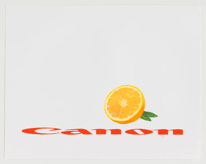
Steve’s visual work comes out of an art historical and cultural tradition of reflection and critique, commenting on photographic mechanization. He had a recent show in New York called “Life as Canon Sees It” at Koenig & Clinton. It was made up of paintings as well as a fabric drop ceiling mimicking the architecture of the gallery. It had a long row of paintings featuring Canon and Nikon logos. Steve was rendering these logos—and camera lenses, and oranges—in different ways.
The dissection of these familiar icons was a continuation of his photographic series “Branded Light,” which, as the name implies, was just that: partial and distorted film company logos, shot in black and white to make compositions. Corporate logo advertising is something we’re both fascinated with, and continue to discuss.

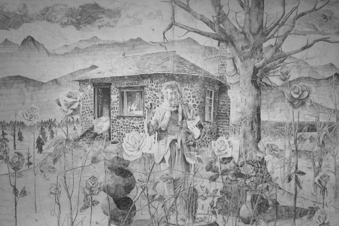
Artists often want to be original, yet it’s humbling to find that someone else has already made everything you’ve ever thought of making, usually 50 years earlier. I’ve been a big fan of Vija Celmins’ work for many years. She’s such an amazing renderer, incredibly talented, and the type of imagery she uses is stuff I’ve always been drawn to: magazine covers, the ocean, natural objects. I think the surf community would appreciate her highly rendered, graphite, open-ocean drawings. Her work is beautiful and meticulous.
Several years ago, I came across this image she did—a large painting of a cover from Time magazine, featuring the Los Angeles riots. I was doing miniature covers of magazines at that time. She’d already done them for years.
She had mastered replications. There’s a piece that she made of handmade rocks, which copied real rocks, sitting next to the originals. The replicas are amazing. She made a huge sculpture of a tortoise shell comb that’s in a René Magritte painting.
The idea of recreating things found in other arts, media, and the natural world was very aligned to my artistic interests. When I discovered her, I found someone who’d been working since the 60s to explore ideas that I was interested in. It’s amazing when that happens naturally, when someone has a way of looking at the world that you can really relate to. I was so stoked on her visual imagery and the places she was coming from. At the time, I wanted to be the surfer version of Vija Celmins.
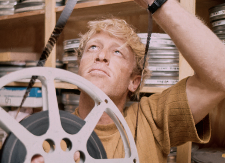
Everybody in the surf community knows about Bruce Brown as a historian, documentarian, explorer, and as a cultural and historical figure. But, people don’t talk that much about Bruce Brown as a visual artist and comic. He made The Endless Summer in 1963 and the aesthetic reflects that time period. The way Cape St. Francis is shot, and the lead up to it, are pure fantasy. He was also trying to make a film with an ethnographic approach to the subculture, as an observer and participant. He was trying to give a really specific viewpoint to outsiders, while also imbuing an insider’s sub-cultural knowledge.
He was also incredibly witty and smart. He used the time period and the political climate to joke about what was going on globally. At one point in the film, he makes a joke about an African surfer doing “a reverse Patrice Lumumba.” When I first saw it, I didn’t know who Patrice Lumumba was, then I learned he was the first democratically elected Congolese Prime Minister, who the CIA had plotted to murder before he was assassinated under President Mobutu in 1961, days before Kennedy came into office in the U.S.
I think it’s amazing that Bruce Brown inserted something like that, making political commentary about a highly charged subject, in one line, in a surf movie. In Slippery When Wet there’s a scene where he says they’re going to disqualify Dewey Weber for surfing in slow motion. He was commenting on film tropes. He had this Mel Brooks element, a style of word humor. Being the son of English teachers, I’ve always found humor in word play. I’ve always appreciated that element in his films.


